Oh, this is fun. Two of my favorite things in one awesome title.
Okay, we, lamentably, aren't talking about food (the most perfect food) but we are actually talking about navigation on a website. You've seen it around… usually you'll see this menu structure in mobile views of your website but we are starting to see this more and more often in desktop views as well.
The real question is, "Do people know what these really are?"
Now, the debate has been going on for a few years. Most people have opinions but they only base that opinion on their personal perspectives. I've seen the debate as to what it's called (some prefer the hot dog menu) and some just want it to go away completely. But, the real test is in how people actually use it.
A few months ago I did a little survey to see what people think. I showed the following image:

What is interesting to me is that most people couldn't explain what it was. Most people didn't naturally know that it was a menu. It was also very interesting that they didn't quite realize that the tops of browsers have that same icon and many mobile phones have that same icon.
They just didn't see the connection.
Now, it's been a few months since I conducted that test. When I showed the following question to the respondents, most people recommended to always include the word menu next to it.

As such, we make sure to include, in all our designs, the word menu.
I think it's fine to be progressive and try to do something that is a little forward thinking but we always want to make sure that we also design for the users that are on the site now and not those that we think will be on our site in the next few years.
The next trend I am starting to see is the hamburger menu on desktop views instead of showing a different menu on the desktop view versus the mobile view.
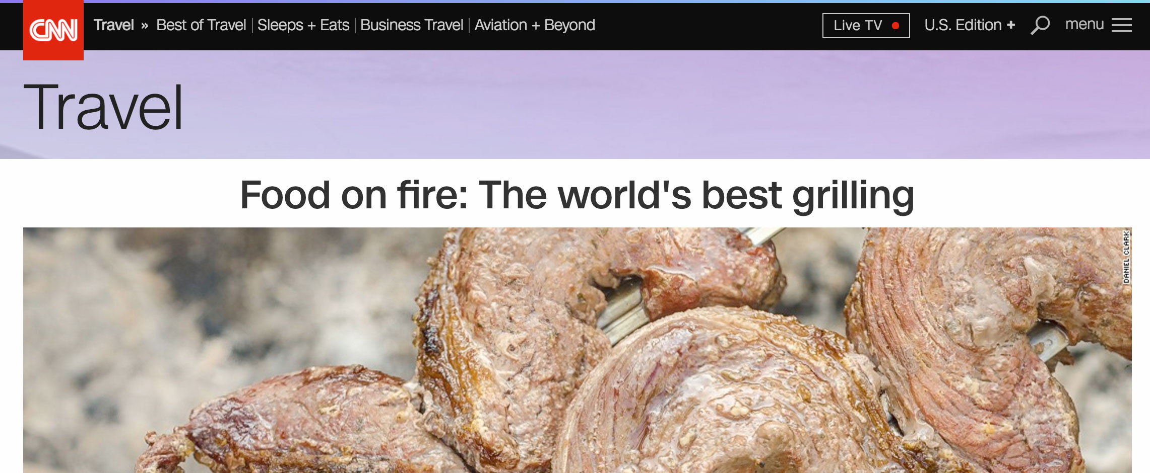
Consider this from CNN:

CNN has the approach of having their traditional menu for the most important elements but then all the 'extra' stuff is in the hamburger menu. Then, when they move to a mobile view, the hamburger menu simply becomes the primary navigation element.
Personally, I tend to like the approach of CNN when you have a lot of items that need to be communicated.
The trend for everyone is to use their mobile devices more office. As such, the trend in design is mobile navigation. Most companies are realizing the benefit of designing from a mobile-first perspective. That design consideration is especially important since it's been well over a year since mobile search as exceeded desktop search.
What do you think? Is the hamburger menu a good idea? Only on mobile devices or should it be included in all broswer sizes?